
Last Updated on January 8, 2024 by Parth Parikh
Table of Contents #
- Logic Tab Help Tips
- User Tooltips – Edit Dialog
- User Tooltips – Fields section Labels
- Hover Tooltips
- Form Item
Logic Tab Help Tips #
Refer to Logic Tab Help Tips on Bitbucket.
Hover Tooltips #
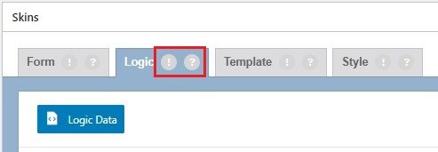
Logic ! hover icon
- Show or hide form fields dynamically. Drag and drop fields or tabs to apply conditional logic to them.
Logic ? hover icon
- Drag and drop a dependent field. Select the field, user or post attribute that the logic is based upon. Add as many logic statements as you need.
Logic Data
- Logic JSON code for duplication
User Tooltips – Fields/Tabs Section #
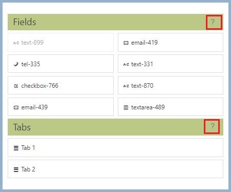
Fields ? hover icon
- Drag and drop any field, that is included in your form, to apply conditional logic to it. Each field can be used once at most. However, you can add multiple logic statements for a single field.
Tabs ? hover icon
- Drag and drop a tab to apply conditional logic to it. Logic can be used with CF7 Skins Multi to show/hide tabs in a multi-page form.
Logic Item #
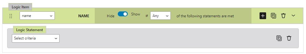
- Drag – Drag/Move Logic Item
- Name
- Label
- Add – Add Logic Statement
- Duplicate – Duplicate Logic Item
- Delete – Delete Logic Item
- Expand – Expand/Collapse
Logic Statement #

- Duplicate – Duplicate Logic Statement
- Delete – Delete Logic Statement
Notes
The added screenshots are based on:
- cf7skins version – 2.5.2
- logic version – 1.1.8
User Tooltips – Edit Dialog #
Refer Add User Tooltips – Edit Dialog.

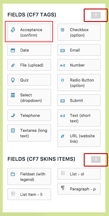
- Acceptance
- Checkboxes
- Date
- File
- Number
- Quiz
- Radio
- reCAPTCHA
- Select
- Submit
- Tel
- Text
- Textarea
- URL
Acceptance #
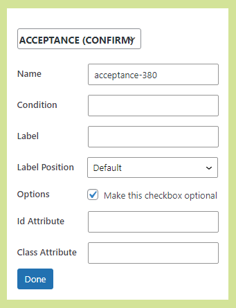
- ? – An Acceptance field prevents users from submitting the form until they check the checkbox
- Name – Unique Id of this form field (auto-generated but can be changed)
- Condition – Text that defines what the form users are accepting
- Label – The text label shown adjacent to this form field
- Label Position – The relative position of the text label adjacent to this form field
- Options – Optional settings for this field
- Make this checkbox optional – HOLD
- ID Attribute – CSS ID added to this field (used for custom CSS styling)
- Class Attribute – CSS Class added to this field (used for custom CSS styling)
Edit Name, Condition, Label, Label Postion(top bottom, left or right), Option, ID Attribute (If any specific ID needs to be used for field) and Class Attribute (If any specific Class needs to be used for field).
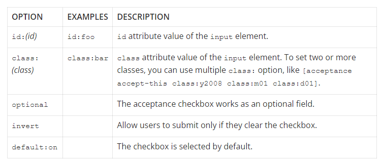
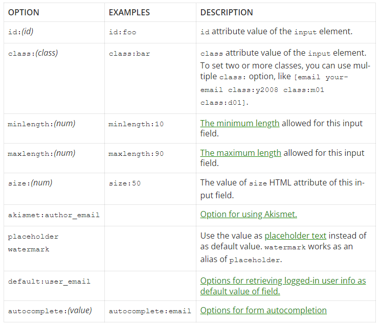
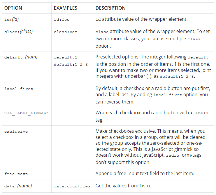
Available options for acceptance – from https://contactform7.com/acceptance-checkbox/
OPTION EXAMPLES DESCRIPTION
id:(id) id:foo id attribute value of the input element.
class:(class) class:bar class attribute value of the input element. To set two or more classes, you can use multiple class: option, like [acceptance accept-this class:y2008 class:m01 class:d01].
invert Allow users to submit only if they uncheck the checkbox.
default:on Check the checkbox by default
Checkboxes #
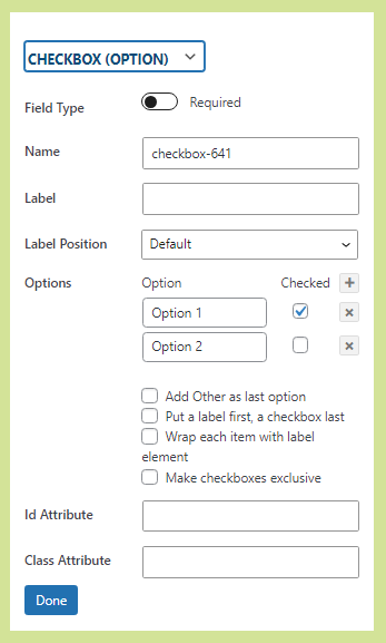
- ? – The Checkboxes field enables users to choose one or multiple checkboxes.
- Field Type – If field should be mandatory or optional
- Name – Unique Id of this form field (auto-generated but can be changed)
- Label – The text label shown adjacent to this form field
- Label Position- The relative position of the text label adjacent to this form field
- Options – Optional settings for this field
- checked – By default the checkbox will be checked
- Add Other as last option – HOLD
- Put a label first, a checkbox last – HOLD
- Wrap each item with label element – HOLD
- Make checkboxes exclusive – HOLD
- checked – By default the checkbox will be checked
- ID Attribute – CSS ID added to this field (used for custom CSS styling)
- Class Attribute- CSS Class added to this field (used for custom CSS styling)
Edit the option, Field type (mandatory or optional), Name, Label, Label Position (top, bottom, left, or right), Options (value for the option and whether checkbox should be checked by default), ID Attribute (If any specific ID needs to be used for field) and Class Attribute (If any specific Class needs to be used for field).

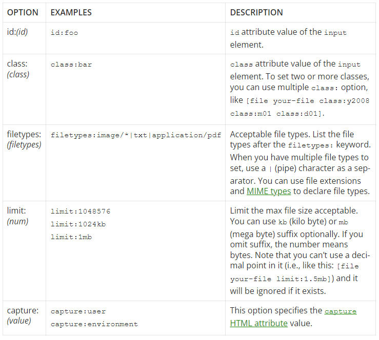
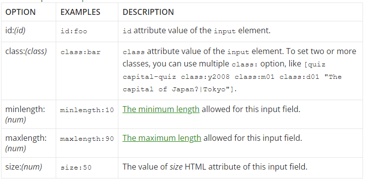
Available options for checkbox, checkbox* and radio – from https://contactform7.com/checkboxes-radio-buttons-and-menus/#checkbox-radio
OPTION EXAMPLES DESCRIPTION
id:(id) id:foo id attribute value of the wrapper element.
class:(class) class:bar class attribute value of the wrapper element. To set two or more classes, you can use multiple class: option.
default:(num) default:2
default:1_2_3 Pre-checked options. The integer following default: is the position in the order of items. 1 is the first one. If you want to make two or more items selected, joint integers with underbar (_), as default:1_2_3.
label_first By default, a checkbox or a radio button are put first, and a label last. By adding label_first option, you can reverse them.
use_label_element Wrap each checkbox and radio button with tag.
exclusive Make checkboxes exclusive. I mean, when you check a checkbox in a group, others are unchecked, so it accepts zero checked or one checked. This is a JavaScript gimmick, so requires JavaScript. Radio button doesn’t support this option.
free_text Append a free input text field to last item.
data:(name) data:countries Get the values from Listo.
Date #
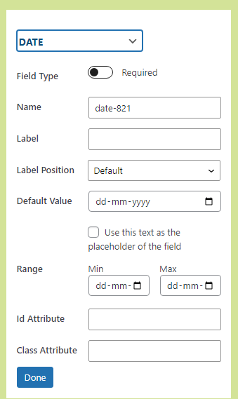
- ? – The Date field enables users to enter a date.
- Field Type – If field should be mandatory or optional
- Name – Unique Id of this form field (auto-generated but can be changed)
- Label – The text label shown adjacent to this form field
- Label Position – The relative position of the text label adjacent to this form field
- Default Value – The default value setting is used to pre-fill the field with some default content.
- Placeholder Checkbox – If checked, the default value will be used as placeholder. Placeholder text is typically used to provide an example of what should be entered into that field.
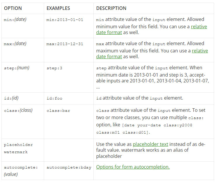
- Range –
- Min – This is the earliest date that can entered into the field.
- Max – This is the latest date that can be entered into the field.
- ID Attribute – CSS ID added to this field (used for custom CSS styling)
- Class Attribute- CSS Class added to this field (used for custom CSS styling)
Edit the option, Field type (mandatory or optional), Name, Label, Label Position (top, bottom, left, or right), Default Value, Range (Range of date from which user can select date), ID Attribute (If any specific ID needs to be used for field) and Class Attribute (If any specific Class needs to be used for field).
Email #
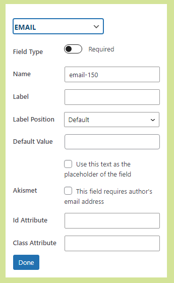
- ? – A Email field enables user to enter a valid email address.
- Field Type – If field should be mandatory or optional
- Name – Unique Id of this form field (auto-generated but can be changed)
- Label – the text label shown adjacent to this form field
- Label Position – the relative position of the text label adjacent to this form field
- Default Value – The default value setting is used to pre-fill the field with some default content.
- Placeholder Checkbox – If checked, the default value will be used as placeholder. Placeholder text is typically used to provide an example of what should be entered into that field.
- Akismet – If checked, Akismet Antispam protection for email field will be enabled.
- ID Attribute – CSS ID added to this field (used for custom CSS styling)
- Class Attribute- CSS Class added to this field (used for custom CSS styling)
File #
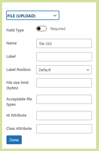
- ? – The file upload field allows users to upload a file.
- Field Type – If field should be mandatory or optional
- Name – Unique Id of this form field (auto-generated but can be changed)
- Label – The text label shown adjacent to this form field
- Label Position – The relative position of the text label adjacent to this form field
- File Size Limit – Use this setting to specify the maximum size in bytes file upload can be.
- Acceptable File – File formats that are allowed to be uploaded.
- ID Attribute – CSS ID added to this field (used for custom CSS styling)
- Class Attribute- CSS Class added to this field (used for custom CSS styling)
Number #
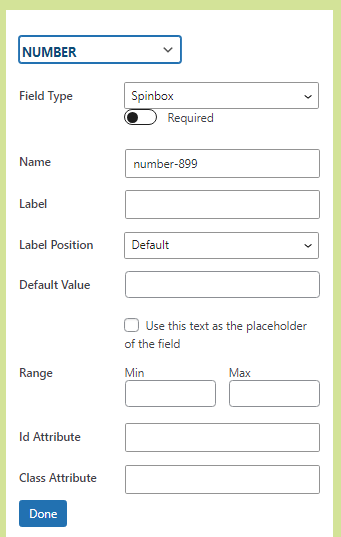
- ? – A Number field allows user to enter a number.
- Field Type – If field should be mandatory or optional
- Name – unique Id of this form field (auto-generated but can be changed)
- Label – the text label shown adjacent to this form field
- Label Position – the relative position of the text label adjacent to this form field
- Default Value – The default value setting is used to pre-fill the field with some default content.
- Placeholder Checkbox – If checked, the default value will be used as placeholder. Placeholder text is typically used to provide an example of what should be entered into that field.
- Range –
- Min – This is the minimum number that should be entered into the field.
- Max – This is the maximum number that should be entered into the field
- ID Attribute – CSS ID added to this field (used for custom CSS styling)
- Class Attribute- CSS Class added to this field (used for custom CSS styling)

Quiz #

- ? – The Quiz field enables the addition of questions and corresponding user-input answers in a form. You can include multiple questions and answers. When multiple questions are included, one question will be randomly displayed to the user, who must provide the correct answer to submit the form.
- Name – Unique Id of this form field (auto-generated but can be changed)
- Label – The text label shown adjacent to this form field
- Label Position – The relative position of the text label adjacent to this form field
- Options – Optional settings for this field
- Question – Questions that needs to be shown to users.
- Answer – Corresponding correct answer to the question which user needs to enter while submitting the form.
- ID Attribute – CSS ID added to this field (used for custom CSS styling)
- Class Attribute – CSS Class added to this field (used for custom CSS styling)
Radio #

- ? – A Radio Button field allows user to select one option from a list.
- Name – Unique Id of this form field (auto-generated but can be changed)
- Label – The text label shown adjacent to this form field
- Label Position- The relative position of the text label adjacent to this form field
- Options – Optional settings for this field
- checked – By default the checkbox will be checked
- Add Other as last option – HOLD
- Put a label first, a checkbox last – HOLD
- Wrap each item with label element – HOLD
- Make checkboxes exclusive – HOLD
- checked – By default the checkbox will be checked
- ID Attribute – CSS ID added to this field (used for custom CSS styling)
- Class Attribute- CSS Class added to this field (used for custom CSS styling)
reCAPTCHA #

- ? – A Recaptcha field prevent bots from submitting forms.
- Label – The text label shown adjacent to this form field
- ID Attribute – CSS ID added to this field (used for custom CSS styling)
- Class Attribute- CSS Class added to this field (used for custom CSS styling)

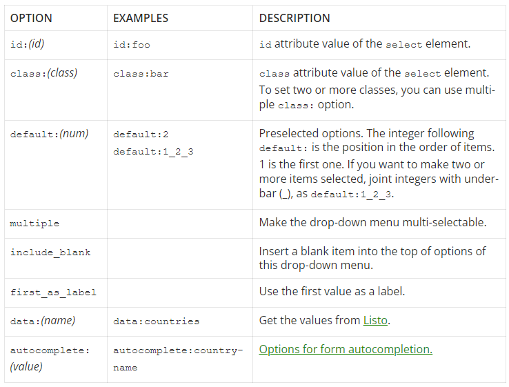
Select #
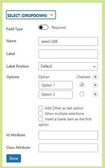
- ? – A Select field allows user to select single/multiple options from the list.
- Field Type – If field should be mandatory or optional
- Name – Unique Id of this form field (auto-generated but can be changed)
- Label – The text label shown adjacent to this form field
- Label Position – The relative position of the text label adjacent to this form field
- Options – Optional settings for this field
- Add Other as last option – HOLD
- Put a label first, a checkbox last – HOLD
- Wrap each item with label element – HOLD
- Make checkboxes exclusive – HOLD
- ID Attribute – CSS ID added to this field (used for custom CSS styling)
- Class Attribute – CSS Class added to this field (used for custom CSS styling)
Submit #
Tel #

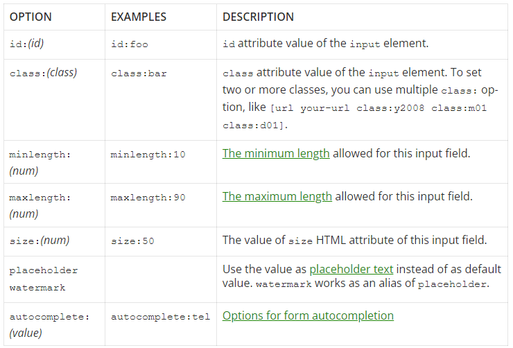
- ? – A Telephone field allows users to enter a phone number.
- Field Type – If field should be mandatory or optional
- Name – Unique Id of this form field (auto-generated but can be changed)
- Label – The text label shown adjacent to this form field
- Label Position- The relative position of the text label adjacent to this form field
- Default Value – The default value setting is used to pre-fill the field with some default content.
- Placeholder Checkbox – If checked, the default value will be used as placeholder. Placeholder text is typically used to provide an example of what should be entered into that field.
- ID Attribute – CSS ID added to this field (used for custom CSS styling)
- Class Attribute- CSS Class added to this field (used for custom CSS styling)
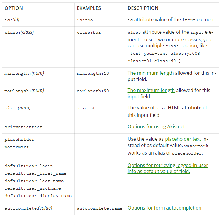
Text #
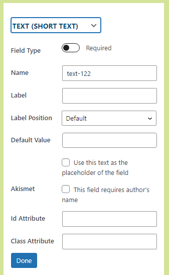
- ? – A Textbox field allows users to submit a single line of text.
- Field Type – If field should be mandatory or optional
- Name – Unique Id of this form field (auto-generated but can be changed)
- Label – The text label shown adjacent to this form field
- Label Position- The relative position of the text label adjacent to this form field
- Default Value – The default value setting is used to pre-fill the field with some default content.
- Placeholder checkbox – If checked, the default value will be used as placeholder. Placeholder text is typically used to provide an example of what should be entered into that field.
- Akismet – If checked & field is used for name, Akismet Antispam protection for Name field will be enabled.
- ID Attribute – CSS ID added to this field (used for custom CSS styling)
- Class Attribute- CSS Class added to this field (used for custom CSS styling)
Textarea #

- ? – A Textarea field allows users to enter multiple lines of text.
- Field Type – If field should be mandatory or optional
- Name – Unique Id of this form field (auto-generated but can be changed)
- Label – The text label shown adjacent to this form field
- Label Position- The relative position of the text label adjacent to this form field
- Default Value – The default value setting is used to pre-fill the field with some default content.
- Placeholder checkbox – If checked, the default value will be used as placeholder. Placeholder text is typically used to provide an example of what should be entered into that field.
- Akismet –
- ID Attribute – CSS ID added to this field (used for custom CSS styling)
- Class Attribute- CSS Class added to this field (used for custom CSS styling)
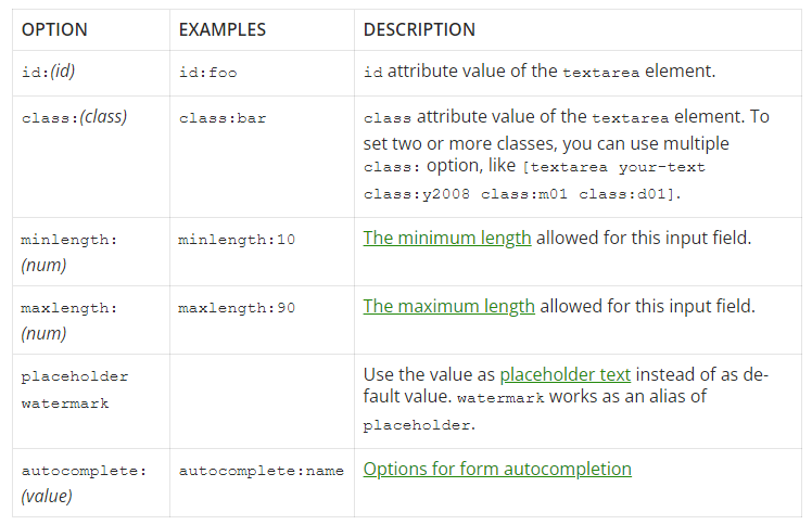
URL #
- ? – A URL field allows users to enter a website URL.
- Field Type – If field should be mandatory or optional
- Name – Unique Id of this form field (auto-generated but can be changed)
- Label – The text label shown adjacent to this form field
- Label Position- The relative position of the text label adjacent to this form field
- Default Value – The default value setting is used to pre-fill the field with some default content.
- Placeholder checkbox – If checked, the default value will be used as placeholder. Placeholder text is typically used to provide an example of what should be entered into that field.
- Akismet – If checked, Akismet Antispam protection for URL field will be enabled.
- ID Attribute – CSS ID added to this field (used for custom CSS styling)
- Class Attribute- CSS Class added to this field (used for custom CSS styling)

Edit the option, Field type (mandatory or optional), Name, Label, Label Position (top, bottom, left, or right), Default value (automatically added on the frontend, checkbox for placeholder), Akismet (mandating author’s name), ID Attribute (specific ID for the field), Class Attribute (specific Class for the field).
Fields (CF7 Skins Items) #
Fieldset (with legend) #

- ? – A title for your fieldset which provides context to the fieldset group.
- Legend – The best practice for legend is to always used text for it.
List – ol #

- ? – Acts as a container for multiple form fields which group together related fields to allow more detailed styling and CSS customization.
- Style Class – Pre-defined class by CF7 Skins that can be used to arrange fields in specific ways.
- Style Grid – Grid class is used to create a grid in different formats.
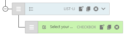
List Item – li #

- ? – Holds single form field. Drag & drop them up and down to change the order they appear on your form. Every Contact Form 7 tag has its own LIST-LI item.
- Style Class – Pre-defined class by CF7 Skins that can be used to arrange fields in specific ways.
- Style Grid – Grid class is used to create a grid in different formats.
Paragraph – p #

- ? – A paragraph allows you to add text in the form which can be used to provide information to user filling the form.
- Content – The content added here will be shown to the user.
HTML #

- ? – You can use this item to easily add HTML Tags that you require in your form.
- Content – The content added here will be shown to the user.
User Tooltips – Fields section Labels #
Refer Add User Tooltips – Fields section Labels.
Acceptance (confirm)
Checkbox (option)
Date
Email
File (upload)
Number
Quiz
Radio Button (option)
ReCaptcha
Select (dropdown)
Submit
Telephone
Text (short text)
Textarea (long text)
URL (website link)
Hover Tooltips #
Form ! hover icon
To add fields, drag & drop them form the fields sectionThis is the form visual editor. It is where you can see and interact with your form’s fields and structure. Saved changes automatically update all of the form’s Contact Form 7 tags and syntax, CF7 Skins items, and automatically create the form’s HTML and CSS.Drag and drop fields up and downyour structureto re-order them. Any field content can be changed by clicking Edit on the field. Click Save Visual to update your Contact Form 7 form.
Form ? hover icon
Use the buttons at the end to edit, copy or remove fieldsCreate a new formstructureby selecting a template. Or, build your own. Drag and drop fields into the visual form editor from theright-hand sideFields section. Edit, duplicate, or delete a field using the field’s icons.Drag and drop fields up and down your structure to re-order them. Click Save Visual to update your Contact Form 7 form tags and syntax and CF7 Skins items.
Logic ! hover icon
- Show or hide form fields dynamically. Drag and drop fields or tabs to apply conditional logic to them.
Logic ? hover icon
- Drag and drop a dependent field. Select the field, user or post attribute that the logic is based upon. Add as many logic statements as you need.
Template ! hover icon
Each Template acts as a an easy to follow guide, which can be adapted to your requirementsTemplates are pre-created forms that automatically create the form’s structure and content for you. Each template works asis likean easy-to-follow guide.
Template ? hover icon
Choose a Template for your form – then you can add, copy or remove fields to match your requirements.Select a template that closely matches your needs then switch to the CF7 Skins Form tab to add, duplicate or remove fields to match your requirements.The form structure appears in the form visual editor.Any field content can be changed by clicking Edit on the field.The template and any edits on the visual form editor do not take effect until you click save.
Style ! hover icon
Each Style covers the full range of standard form elements available within Contact Form 7A style is what makes your form look great.Styles are pre-createdthemes anddesigns (CSS code) that are automatically applied to your entire form. They cover all standard Contact Form 7 elements.
Style ? hover icon
You can change the Style applied to your form by simply selecting a different StyleSelect a style that aligns with your site’s design. To see the style applied, save and go to the page that has the form. To change the style, select another any time.For advanced customization, you can modify the CSS.
Fields (CF7 Tags) ? icon
drag/click tag to addDrag and drop or click a Contact Form 7 Tagare the available fields for your form.to adda tagit to the visual form editor. To see howitemsFields are used, select a templateand view the layout on the form visual editor– it’s a great way to get started quickly. Any field content can be changed by clicking Edit on the field.A tag’s edit icon on the form visual editor allows you to edit the tag name, options, and values. Saving the form will update Contact Form 7 tags and syntax, CF7 Skins items, and automatically create the form’s HTML.
Fields (CF7 Skins Items) ? icon
drag/click tag to addUse CF7 Skins Fieldsitems arefor the layoutand foundationof your form. Fieldsets, legends, and lists are used to group related fields, add context to them,and allow for more detailed styling.To see how items are used, select a template and view the layout on the form visual editor. To add your own item onto the form visual editor, drag and drop or click an item.
Form Item #
- Expand/Collapse – Expand/Collapse
- Drag/Move Field – Drag/Move
- Field Icon
- Field Label
- Field Type
- Ready Class – Ready class (CF7 Skins Ready Add-on)
- Grid – Row Span – DONE (CF7 Skins Ready Add-on)
- Grid – Field Span DONE (CF7 Skins Ready Add-on)
- Edit – edit – DONE
- Duplicate – duplicate – DONE
- Delete – delete – DONE
- Add-on Drop-down menu – Add-on options
Further Reading
Remove this line & everything below this once the above article has been approved
Notes
2018-02-08 – from Neil
This will be useful as a guideline going forward.
Goal: providing timely, useful, additional info to users at all experience levels
The Visual layout includes:
- the drag and drop icon
- an icon for the field tag
- the label (if entered)
- a ‘required’ star sometimes
- the field tag name
- edit/copy/delete
sometimes an icon to ready classes (duplicating the ready classes in the edit section of these fields, which would mean repetitive tooltips for both sections.)
We’ve also found it’s helpful to do this early on for larger more complex issues like this. It helps:
- share your ideas with others early on
- provide early feedback
- others to contribute their thoughts
- give clearer focus on what is required.
2018-02-05 – from Katie
If every icon, text, and field has the need for a hover tooltip, there are a few issues:
- First, if we need to explain every little thing, then there’s probably something wrong with the design
- Second, I think it will be visually overwhelming
- Third, the tooltip content (that could fit within a certain character limit in the field input area) wouldn’t truly be that helpful